Introducing Farrow & Ball's 2025 New Paint Colors: A Fresh Palette for Inspired Interiors
Farrow & Ball, the iconic British paint brand renowned for its rich, nuanced hues and luxurious finishes, has just unveiled 12 stunning new colors for 2025. If you're a lover of timeless interiors with a modern edge, this collection is set to inspire your next home refresh.
Meet the 12 New Colors for 2025
Each new shade has been meticulously crafted to enhance a variety of spaces, from bold statement walls to subtle, elegant backdrops. Farrow & Ball continues to set the tone for sophisticated, heritage-inspired interiors, and this year’s palette doesn’t disappoint.


The 12 New Colors for 2025:
Dibber – Earthy, mossy green inspired by traditional gardening tools.
Douter – Sooty gray-green with a sophisticated, smoky depth.
Duster – Deep ochre reminiscent of a well-loved duster cloth.
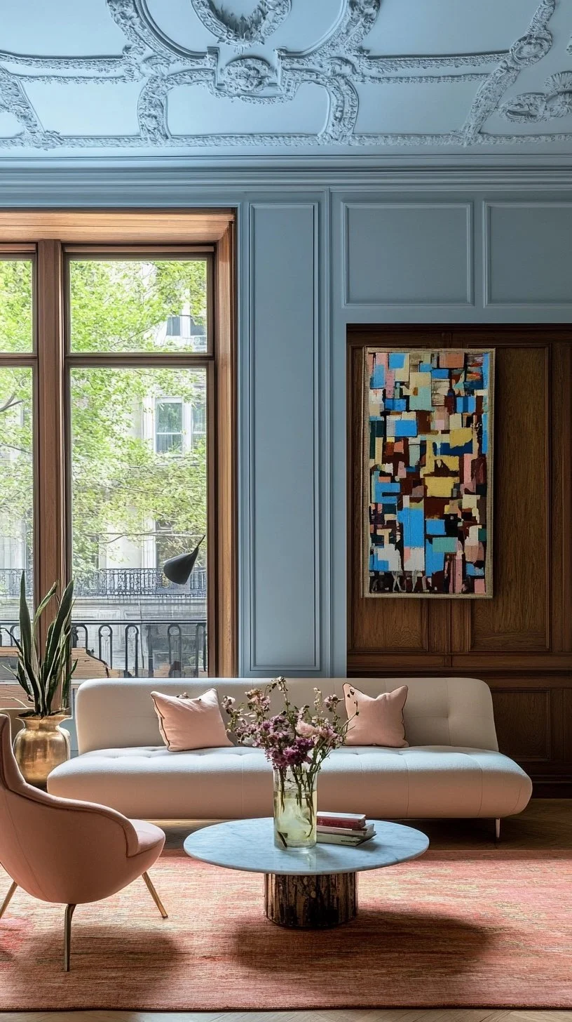
Kakelugn – A tranquil, light blue inspired by Swedish tile stoves.
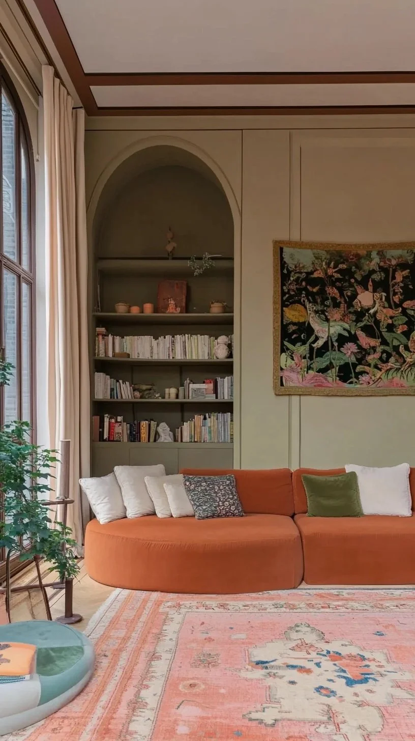
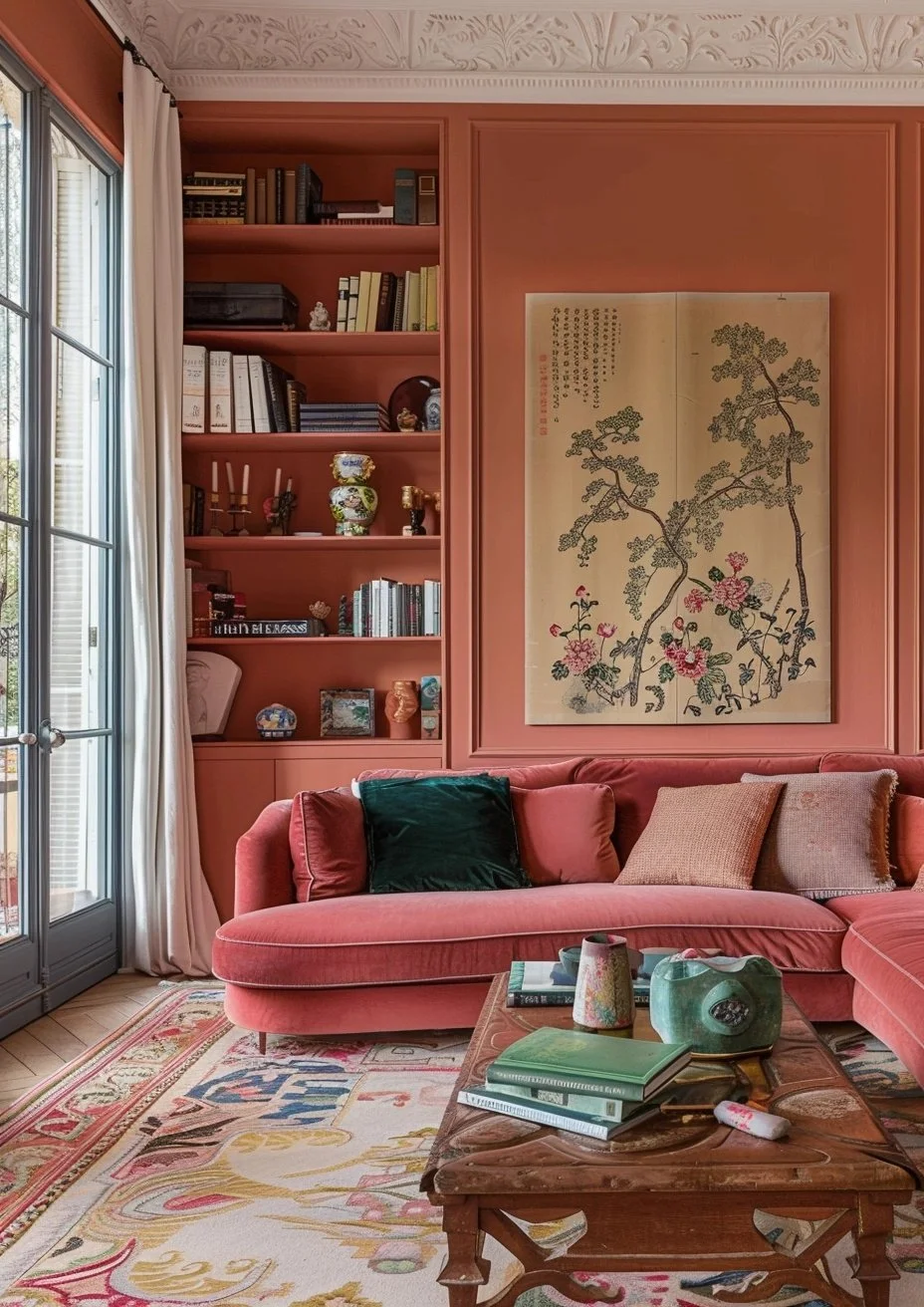
Marmelo – Warm burnt orange, evoking the coziness of quince jam.
Naperon – Faded terracotta for a rustic, organic look.
Reduced Green – Dark, muddy green with rich brown undertones.
Scallop – Soft off-white with delicate pink undertones.
Sizing – Crisp, blue-based off-white for a fresh, clean feel.
Broccoli Brown – Reintroduced deep stone shade for natural interiors.
Etruscan Red – Classic, rich brown-red perfect for timeless elegance.
Sap Green – Deep, saturated olive green making a bold statement.
How to Pair These New Colors with Wallpaper
A beautifully painted wall is even more striking when paired with the right wallpaper. Our friends at The Ottoman Empire Furniture have put together a must-read guide on how to match Farrow & Ball’s latest hues with timeless wallpaper designs. Whether you want a traditional floral, a bold geometric, or a subtle textured backdrop, their expert insights will help you create a cohesive and effortlessly chic space. Check out their blog here.
Why Farrow & Ball Paint is Worth the Investment
If you’re new to the world of Farrow & Ball, you might be wondering—why all the hype? Here’s why their paint remains a favorite among designers and homeowners alike:
Unmatched Depth & Pigment – The brand’s distinctive use of high-quality ingredients results in a unique depth that shifts beautifully with natural and artificial light.
Eco-Friendly Formulas – Farrow & Ball has been ahead of the curve in providing low-VOC, water-based paints that are as kind to the environment as they are to your walls.
Exceptional Durability – Their finishes are designed to withstand daily wear while maintaining their exquisite appearance.
Effortless Elegance – Whether you choose their classic matte Estate Emulsion or the washable Modern Emulsion, each finish offers a timeless, lived-in look.
Where to Use These New Colors
Wondering where to incorporate these fresh hues? Here are a few ideas:
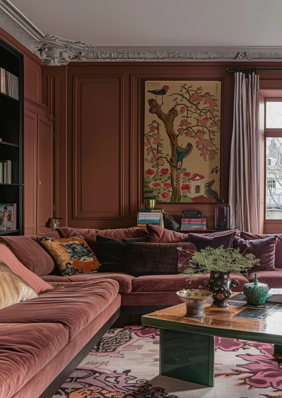
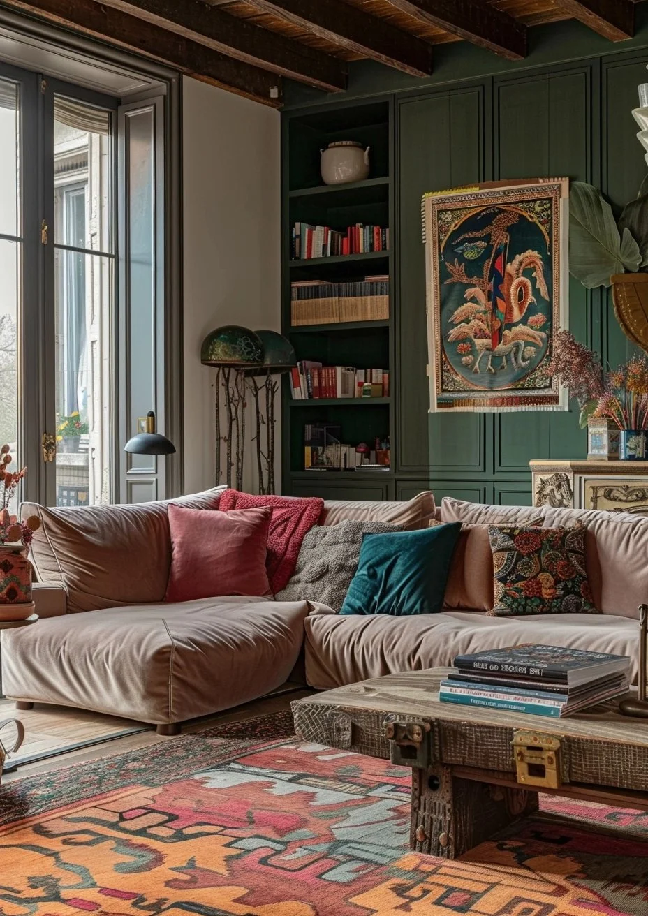
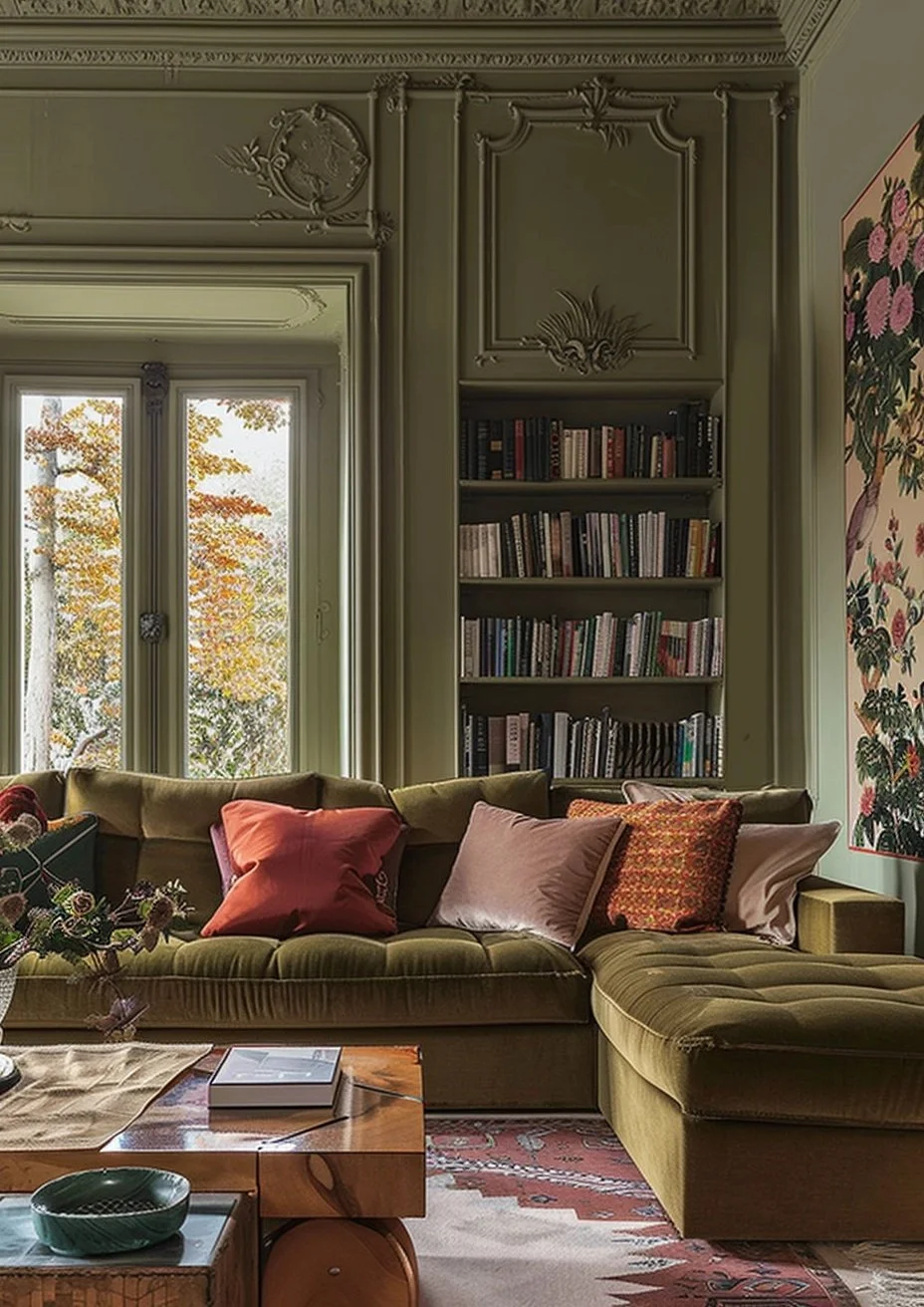
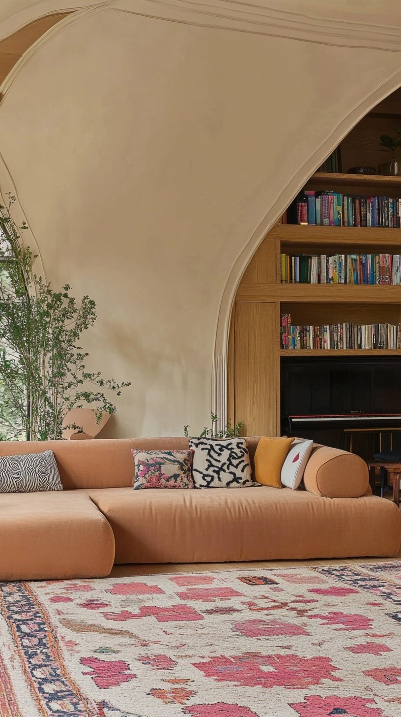
Living Rooms – Create a cozy yet sophisticated ambiance with a rich neutral or a deep, inviting blue.
Kitchens – Introduce a pop of color on cabinets or a feature wall to modernize your space.
Bedrooms – Soft pastels or earthy tones can set the mood for a restful retreat.
Home Offices – A grounding shade can enhance focus and creativity while adding a designer touch.
Get Inspired & Start Your Project
The unveiling of new Farrow & Ball colors always sparks excitement in the design world, and this year’s collection is no exception. Whether you're planning a full room transformation or a simple refresh, now is the perfect time to embrace these exquisite hues.
And don’t forget—if you need guidance on how to mix and match these colors with wallpaper, be sure to explore The Ottoman Empire Furniture’s expert blog for expert styling tips.
Which of the new shades are you most excited to try? Let us know in the comments!